Tuesday, June 26, 2012

Easy Summer Cards: What's the Scoop?

I love the way that so many manufacturers make it easy to add a bit of whimsy to layouts and cards.  I am particularly fond of the die cuts that come with each line at My Mind's Eye.


This die cut sheet from On the Sunny Side is a case in point.  Look at all those fun summer icons.


You can use the die cuts as is or you can doctor them up.  I used the ice cream truck (upper L) for my card and altered it by adding brad wheels and a layered sticker with ice cream icons. I used foam tape underneath to give it dimension on the card.


For the card base, I used a folded card from Memory Box. Love those.  There you have it.  A quick and easy summer card.


I hope you have a great day.  Me?  I'm off in search of ice cream.....

Friday, June 22, 2012

Everyday greetings: LYB hello

Do you ever look at your stash of cards and realize that you don’t have enough everyday greetings? I have lots of cards specific to holidays, but not enough cards with simple sentiments like hello, thinking of you and get well soon.

Today I have a simple card with a simple sentiment. I love to make panel cards because they are so quick and easy and a good way to use scraps, yet they look pulled together.

  
Here I used patterned paper from Little Yellow Bicycle’s Hello Fall! line. The colors work so well together and are good for any time of year. Cheery without being cutesy. I made the three panels an even size and stitched them onto a card front. I usually stitch on card fronts rather than directly on the card itself so that the stitching doesn’t show through on the other side.
 
The label and alphas are from October Afternoon, the tree is My Little Shoebox and the birds are Jillibean Soup.

Thanks so much for stopping by. I hope you have a great weekend.

Tuesday, June 19, 2012

Pink Paislee: Beach Bum

For my baby’s first birthday, we took him down to the beach. It was an unusually warm April weekend, yet not too many tourists were there. We had the beach to ourselves and had such a lovely, relaxing time.

My little one couldn’t have loved it more. He was so content to sit on the shore and play in the sand and watch the waves. And I was so content to sit on the shore and watch him play. And take photos, of course. I generally had him all covered up, shirt, swim trunks, hat, sunscreen. But I did manage to sneak a few less covered-up pics....


I used Pink Paislee’s Nantucket and Snowday collections on this page. I love how well they work together. That plaid Snowday print looked so summery to me with the turquoise and apricot hues. And even though the paper was in a different color scheme than my son’s plaid hat, I thought the paper worked well here.


At the beach, planes often fly overhead, carrying banners advertising cheap tee shirts and all you can eat buffets. I wanted to mimic that idea here with my title work.

This layout actually is a do-over. I first made this page when I was a beginner scrapbooker and I wanted to make it a bit more contemporary. The original page was made with Cosmo Cricket’s Snorkel line, and you can still see remnants of the original layout here: the weathered wood background paper, the plane, banner and clouds.  Alphas are Webster's Pages.

Friday, June 15, 2012

Simple Stories: My Creative Sketches

Last year, Simple Stories' 100 Days of Summer was one of my favorite collections. I have been eyeing the new summer collection ever since it was announced in April.  Summer Fresh is such a fun mix of denim, burlap, florals and bright colors with a down-home feel.  I love it.  

I used Summer Fresh on this page of my little one at 13 months.  We were at the US National Whitewater Center, watching the kayakers, and I caught this profile of Cory in his stroller, looking so intently.  The tag under the photo tells a little more about our outing there.


The blue paper is one of the new Simple Basics papers that coordinate with each collection. I love that Simple Stories starting making these basics. They are perfectly, well, simple. I used Sky Blue Daisy. 

Here's a close-up of the top of the layout.   


The layout is based on the new June sketch at My Creative Sketches.  We kick off a new challenge every month, mid-month, with a great prize.  Here's the new sketch:


The new challenge runs until July 14.  We'd love to have you join us.  You can find all the details here on the My Creative Sketches blog. 

Tuesday, June 12, 2012

Handprint Father’s Day Idea & Card


I can’t believe we’re already into the middle of June and Father’s Day is just around the corner. My little guy is so close to my Dad, his Pop Pop, and each year I give Dad a Father’s Day present from Cory.

This year, Cory's giving Dad a painted set of handprints:


This project was really quick and easy to make.  You just need black acrylic paint, heavy cardstock, alphas and a willing toddler.  I painted my son's hands then he stamped them on cardstock.  It's best to do this right before bathtime.  Just sayin'. I got the idea for this project from pinterest.


Last year, Cory gave Dad a green tie:

 
And I’m giving Dad this card:


Which was published last month in PaperCrafts magazine's Card Creations:


How about your kids? What are you working on for Father’s Day?

Linking handprint project to Tip Me Tuesday here.

Sunday, June 10, 2012

Altered Frame: Hexagon Punch


Hi!  Today I have an altered summer frame using hexagons as my backdrop. 

For my project, I altered an old picture frame. I used patterned paper from Canvas Corp and Bella Blvd, cutting them with a hexagon punch, and adhering them them to black cardstock. 


I used seven patterns from Canvas Corps White Basics line and two patterns from Bella Blvd’s Sunshine and Happiness collection for the base of my project.


Then I used a hexagon punch from Creative Memories to punch a bunch of shapes for the base of my project.


I arranged the the hexagons on black cardstock and stitched around the edges to form the base of my project. I love the way the black makes the color pop. Using black also gives the project more depth when inserted in a frame.


Here's a closeup of the top of the altered frame.  I used a large burlap flower from Canvas Corp as the sun and added a tag as a title spot.  Alphas are Webster's Pages.  Banner pieces are October Afternoon.


Here’s a closeup of the bottom of the frame. I added a photo of my son in the pool and a piece of chipboard from My Mind’s Eye to the hexagon background. On the frame itself, I added waves punched from Canvas Corp paper and a large felt flower. I wrapped some burlap string around the flower stem to echo the burlap sun at the top.


Thanks so much for stopping by! 

Friday, June 8, 2012

Tutorial : How To Make A Pinwheel and Other Tricks


Today I’d like to show you the fourth layout I made with the June Creative Kit at My Creative Scrapbook and a couple techniques I used. This kit feautured On The Sunny Side from My Mind’s Eye.


This is my preschooler taking a test drive on his new bike in our backyard. I wanted to show a sense of movement on the layout. I used a circle punch on the kraft cardstock to make a negative circle, then backed it with colorful geometric paper that was sort of arrow shaped. 


To emphasize the arrows and to suggest the forward roll of the bicycle, I punched small corners from white cardstock and stacked them together for thickness. Then I placed the corners like arrows across the negative punched circles and stitched them on the page. I repeated this in the opposite corner to help take the eyes around the page.


Another technique I used on this page was to make my own pinwheel. The kit included two small pinwheels with brads and I wanted to make a third and cluster the three together.


Pinwheels are super easy to make. Just start with a square, any size, from double-sided patterned paper (both sides with show).


Here, I used a 2-inch square punch but you could also cut your own square or use a die cut machine.  Fold your square til the corners touch and crease the fold marks, then fold the square again from the other corners and crease. 


Use the crease marks as guidelines for cutting the pinwheel. Cut halfway down every other crease, then fold the corner over to the middle.  Place a brad or button in the center.

Thanks for stopping by. You can find more information about the June kits at My Creative Scrapbook here. For information on the June Prima contest, click here.  It's super easy to enter; just submit your answers to three questions about My Creative Scrapbook.

Wednesday, June 6, 2012

Clean and Simple Pages with My Creative Scrapbook

I’m back today with two more layouts from the June reveal at My Creative Scrapbook. These pages show how to use the “Creative” kit in a clean and simple style. I love to use grid designs. It’s an easy way to show off bits of patterned paper yet not overwhelm your page.

I do believe that an old-fashioned square punch is my favorite scrapbooking tool. Here I used a punch to cut 4 squares to add a bit of color and pattern to a simple page.


The kit came with a plain chipboard branch. I painted it brown, then snipped it apart to make two separate perches for the sweet little birdies. The watermelon was a die cut and I backed it with cardboard and added gem seeds to give added dimension.

My second layout follows a similar design, but I used strips of patterned paper, instead of squares. This is Cory on his second birthday.


We had gone to Great Wolf Lodge for the weekend and on the way home, we stopped by McDonald’s. As a special treat, he got an ice cream cone as his bedtime snack that night. The ice cream patterned paper and embellies in this kit were perfect for this photo.

Below is a photo of the June Creative Kit. It’s full of My Mind's Eye goodies from On The Sunny Side. I love that collection.  You can find all the June kits here at My Creative Scrapbook. 


Tuesday, June 5, 2012

June Kit Reveal Day at My Creative Scrapbook

Today is reveal day at My Creative Scrapbook and I’m so excited to share the kit and the first of the layouts I have been working on. I used the “Creative” kit which featured the Sunny Side collection by My Mind’s Eye. It’s such a pretty, playful kit full of summery goodness.


This is a layout celebrating my son’s favorite ice cream man. Earlier this year, my parents bought an ice cream vendor business and my preschooler loves going to festivals and venues in search of his favorite vendor. The top photo shows my Dad handing Cory a free dish of vanilla and the bottom photo is Cory adding sprinkles. My little one is very serious about the sprinkles!


I loved how perfectly the summer theme of this paper fit my photos. This kit has the cutest embellies. This little ice cream truck was one of my favorites. The kit also includes a die cut sheet and I sewed the banners from that sheet down the side for a festive look. The title says: Found A Favorite Vendor.

I have three more layouts to show you with this kit. I’ll be back tomorrow with two clean and simple pages and on Friday with a technique page and tutorial. You can see all the kits and reveals in the design team gallery here.

There are so many exciting things happening this month at My Creative Scrapbook. We are launching two new monthly add-on kits: Dusty Attic and Mixed Media. You can find out the details on the My Creative Scrapbook website here

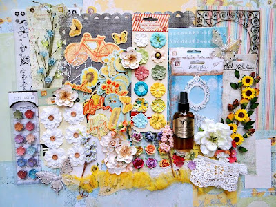
We’re also holding a Prima contest and there are some seriously fabulous prizes up for grabs. (See pic below!!) 


To enter the Prima contest, just answer three questions, which are posted on the blog for My Creative Scrapbook here. 

Monday, June 4, 2012

How To Curl Twine: Vase of Paper Flowers


I am delighted to announce this news today:  I’ve joined the design team of Trendy Twine.  I first fell in love with Trendy Twine back in January when I was a guest designer. The twine is such a great weight and lays and falls so nicely. Trendy Twine is a three-color twist that comes in traditional colors mixed with white as well as custom colors mixed with other colors. It’s beautiful to work with and I couldn’t be more excited to join the team.

Let’s see some Trendy Twine at work, shall we? For this project, I made a vase of paper flowers.

 
I used flower kits from Little Yellow Bicycle’s Paradise and Wonder & Wishes collections to make the accordian flowers, added button centers from Basic Grey, then attached the flowers to floral wire stems. To incorporate the twine, I wrapped Twisted Lime twine around the five largest flowers.


To make a curled "ribbon" from twine, I wet the twine with glue, using Claudine Hellmuth's Multi Medium Matte.  While wet, I wrapped the twine around a straw. Once the twine dried, I unwound it from the straw and the twine sprung right back into shape. (Note the twine in the demonstration below is a different shade of green).


Here is a close-up of the curly cue twine ribbon.


To celebrate the new design team, Trendy Twine is having a blog hop and is giving a way a spool of twine (winner's choice) to a commenter chosen by random draw. You can find all the details on the Trendy Twine website here.  

Thanks so much for stopping by.  I really appreciate your visit.  I'll be back tomorrow with reveal day and a Prima contest from My Creative Scrapbook.

Linking this to Tip Me TuesdayTater Tots & Jello and Today's Creative Blog.

Friday, June 1, 2012

Sneak Peeks: My Creative Scrapbook Kit

Some exciting things are happening this month at My Creative Scrapbook. A new kit is revealed on June 5 and we are launching a month-long Prima contest with lots of prizes.

Next week, I'll show you full reveals and will have more info on the Prima contest.  For now, I have a few sneak peeks of layouts using the June kit.  Do you recognize this line or manufacturer?


For more peeks and info on the June kit, visit My Creative Scrapbook here. Thanks for stopping by. I hope you have a wonderful weekend.
Related Posts Plugin for WordPress, Blogger...